Does Your Presentation Stand Out Visually?

Note:
This article accompanies material presented in an Education Session at the District 2 Toastmasters fall conference held in Seattle, Washington on November 15, 2008.
Introduction
There is a growing wave of discontent with the PowerPoint status quo. Audiences are disappointed with slide presentations where the presenter does little more than narrate a series of slides filled with bullet-point text.
Some blame PowerPoint itself for this, and suggest that it should be abandoned.
Others, like me, believe that PowerPoint can be an extremely powerful tool for a presenter who understands how to develop presentations with strong visuals which complement and enhance the presentation.
Principle 1 – Redundancy Effect
Stimuli are perceived by one of our five senses, and then processed in our brain.
- Text on slides is perceived visually, and processed verbally in the brain.
- Speaker’s words are perceived audibly, but also processed verbally in the brain.
Simultaneous stimuli processed in the same way (e.g. two verbal stimuli) inhibit learning. In other words, slides filled with text which duplicate the speaker’s words are ineffective. You would be better off without the slides!
Principle 2 – Modality Effect
Simultaneous stimuli processed in different ways (e.g. visual, verbal) enhance learning.
Visual slides (charts, photographs, diagrams, video, etc.) are processed by our brain visually. When complemented by the speaker’s words, they enhance learning.
This is the fundamental reason why visual aids can be powerful components of a presentation.
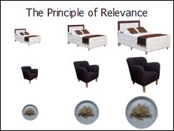
Principle 3 – Principle of Relevance
 Communication is effective when neither too much nor too little information is presented.
Examples of applying the Principle of Relevance to slide design:
- Titles should be assertions, not labels.
- Make meaning of data/charts explicit.
- Design diagrams to audience interest level.
- Simplify. Eliminate non-essential information, including anything appearing on all slides.
- One concept = one slide.
Principle 4 – Appropriate Knowledge
 Communication requires prior knowledge of pertinent concepts, jargon, and symbols.
Examples of applying the Principle of Appropriate Knowledge to slide design:
- Use chart types familiar to audience, or be prepared to explain them.
- Use terminology familiar to audience (e.g. if your audience refers to “the first quarter of the year” as “Q1”, then your slides should use “Q1”).
- Evoke emotional response (based on prior knowledge) from audience with photographs.
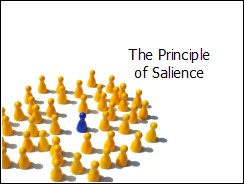
Principle 5 – Salience
 Attention is drawn to large perceptible differences (e.g. size, color, position).
Examples of applying the Principle of Salience to slide design:
- Titles should stand out.
- Use text size/formatting to indicate salience. Larger text is more salient than smaller text.
- Highlight key data (sets or individual values).
- Explode only necessary pie slices.
- Logos pull attention away from slide content.
Principle 6 – Discriminability
 Two properties (e.g. size, shape, color) must differ by a large enough proportion to be distinguished.
Examples of applying the Principle of Discriminability to slide design:
- Make text large enough to read.
- Use Mixed Case (NOT UPPERCASE), and avoid text “effects” which reduce readability.
- Use the whole slide for charts, diagrams, or pictures (i.e. bigger = easier to see).
- Avoid backgrounds which reduce contrast.
Principle 7 – Perceptual Organization
 People automatically group elements into units based on proximity or similarity (e.g. color, size, orientation).
Examples of applying the Principle of Perceptual Organization to slide design:
- Use columns/tables to organize text.
- Align legend keys with data.
- Place labels directly on chart data.
- Place labels close to objects.
- Explode diagrams to expose detail.
Principle 8 – Compatibility
 A message is easiest to understand if its form is compatible with its meaning.
Examples of applying the Principle of Compatibility to slide design:
- 3-D effects distort data.
- Use line charts for trends; bar charts for specific values; pie charts for fractions of whole.
- Show time horizontally & org charts vertically.
- Shapes & patterns should mirror meaning.
Principle 9 – Information Changes
 People expect changes in properties to carry information.
Examples of applying the Principle of Information Changes to slide design:
- Use text formatting sparingly.
- Be consistent across charts(e.g. colors, alignment, groupings of data).
- Be consistent throughout slide deck (e.g. fonts, color palette, slide layouts).
- Avoid gratuitous use of animation.
Principle 10 – Capacity Limitations
 People will not understand a message if too much information must be retained or processed at a given time.
Examples of applying the Principle of Capacity Limitations to slide design:
- Minimize text on slides.
- Scale axes to make numbers readable.
- Reveal complex diagrams gradually (i.e. progressive disclosure).
- Simplify slides to reduce cognitive load.
- Slow down. Give time to digest information.
Recommended Books to Improve Your Slide Design Skills
- Clear and to The Point: 8 Psychological Principles for Compelling PowerPoint Presentations
by Stephen Kosslyn (read the Six Minutes book review) - slide:ology: The Art and Science of Creating Great Presentations
by Nancy Duarte (read the Six Minutes book review) - Presentation Zen: Simple Ideas on Presentation Design and Delivery
by Garr Reynolds (read the Six Minutes book review)
Good Luck!
I hope that these tips and techniques help you improve the effectiveness of your slide presentations.
Please contact me if you have any comments or questions.
The Six Minutes website contains many public speaking articles, including several that feature Toastmasters.
Subscribe to Six Minutes for free to receive future articles.


