
Six Simple Techniques for Presenting Data: Hans Rosling (TED, 2006)
 Hans Rosling presented a fantastic talk at TED. The delivery was inspiring, the mood was electric, and it was all about statistics. Yes, statistics – a topic most often associated with dry and boring presentations.
Hans Rosling uses six simple techniques for presenting data which transform a run-of-the-mill presentation into a must-see presentation.
I encourage you to:
- Watch the video;
- Read the analysis in this speech critique; and
- Share your thoughts on this presentation.
Six Techniques for Presenting Data
Rosling employs GapMinder to display his statistics. This is a wonderful software tool for displaying data, but the real magic of this presentation lies in the techniques demonstrated by Rosling. These techniques are easy to do, but I’ve rarely (if ever) seen them all demonstrated so well in a single talk. The techniques are:

- Explain the data axes
- Highlight subsets of data
- Dig deeper to unwrap data
- Place labels close to data points
- Answer the “Why?” questions
- Complement data with energetic delivery
Let’s examine each one and compare this presentation to common approaches.
Technique #1: Explain the Data Axes
Common approach. Graphs are displayed with either no explanation of the axes, or a quick, obligatory “Here we see variableX versus variableY“.
As Hans demonstrates, don’t assume that your audience intuitively “gets it,” particularly when presenting statistical data.
 Starting around 2:43, he devotes approximately ninety seconds to:
- Explain what quantities are on each of the two axes (e.g. fertility rates versus life expectancy at birth);
- Provide the background story as to why he chose these two quantities (“We vs Them = Western World vs Third World“);
- Share his students’ prediction as to what the data will show.
Because of this careful preparation, the audience understands the context thoroughly. A very energetic description of the data follows while the time advances the “movie” for about 45 seconds.
The “instant reply” is a nice touch which fills the otherwise empty time during audience applause, although I suspect this was added in the post-production by the good folks at TED.
Technique #2: Highlight subsets of data
 Common approach: Presenters attempt to explain complex data which they have studied for days, weeks, or months in just a few minutes. The audience grasps little.
Rosling recognizes the impossibility of explaining all of the data in detail. Instead, he carefully selects and explains subsets of the data.
- Example #1: 1964-2003 United States and Vietnam [5:15 to 6:06] This is a clever choice as his (mostly American) audience will easily connect the early part of this period with that of the Vietnam War.
- Example #2: 1960-2003. South Korea, Brazil, Uganda, United Arab Emirates [12:22 to 13:40]
Technique #3: Dig deeper to unwrap data
Common approach: Presenters restrict themselves to one level of data inspection. Deeper analysis is often only present in scientific journals.
Several times, Rosling displays first a high-level data view (e.g. one point for a country) and then digs deeper to lower-level view of the data (e.g. country quintiles).
 |
 |
- Example #1: Income versus population
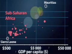
Compare the global curve [7:26] to the one broken down by geographic region [7:54] - Example #2: GDP per capita versus Child survival rate
Compare the Sub-Saharan Africa bubble [9:48] to the individual country bubbles [9:54] - Example #3: GDP per capita versus Child survival rate
Compare Uganda bubble [14:12] to quintile data points for Uganda [14:18]
Technique #4: Place labels close to data points
 Common approach: Data legends and labels are often absent. The presenter assumes that the audience will follow their verbal cues. Or, when legends and labels are present, they are often presented far away from associated data points. This forces the audience to visually scan back and forth.
Throughout Rosling’s talk, data labels are presented right next to the data points. An example is shown here for the OECD data point [9:28].
Additionally, the appearance of these labels is synchronized well with the verbal component of his speech. In this way, the visual labels complement the audio.
 |
 |
 |
Related to this, there are several instances where GapMinder shows a bubble “about to burst” a second or two before the data is expanded. This is a subtle touch, but an effective measure to draw the eye to the right spot on the screen. The Sub-Saharan Africa example shown is from 9:48. Others are at 10:33 and 10:40.
Technique #5: Answer the “Why?”questions
Common approach: Large data sets are presented, and the presenter often explains only the dominant trend or the one measure of most interest. The audience is left to wonder things like “Why is that data point there?” or “What caused that point to be low/high/odd?”
 Obviously, no presenter can answer every question the audience might be thinking, but Rosling does a good job of anticipating these questions. He anticipated several “Why?” questions, and answered them on the spot.
For example:
- Q: Why does the progress in Vietnam accelerate in the 1990’s? [5:43]
A: They give up communist planning and go for a market economy. - Q: Why is Mauritius so different from most of Sub-Saharan Africa? [9:54]
A: Mauritius was the first country to get rid of trade barriers. They could sell their sugar. They could sell their textiles. - Q: Why is China moving up and then to the right (when most countries are moving diagonally)? [11:52]
A: Mao Zedong bought health to China (up) and then he died. Deng Xiaoping then brought money to China (right).
Anticipating and answering the why questions achieves two goals:
- It allows you to satisfy the audience’s curiosity while also maintaining an energetic pace (rather than being interrupted by questions).
- It demonstrates your credibility and solid grasp of the subject.
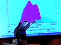
Technique #6: Complement data with energetic delivery
Common approach: Statistical data is often presented in a dry, clinical manner. Perhaps the theory is that the audience should naturally be excited about data?
 |
 |
The most memorable technique displayed by Rosling is his energetic delivery. Examples are numerous, and include:
- Highly energetic sequence as he narrates 1962-2003 fertility rates versus life expectancy [4:15 to 5:03]. This is the highlight of the presentation for me. The audience seems to agree, rewarding Rosling with 13 seconds of applause.
- Spider-web shape with his hands to demonstrate how the bubbles burst [9:55]
- Ghost-like acting to accompany “overlooking the United States, almost like a ghost” [18:11]
- Approaching the screen numerous times to align his arms and body with the data
The thoughtful presentation of data makes this an understandable talk. Rosling’s energetic delivery makes it memorable.
Your Thoughts?
Lisa Braithwaite ponders whether this is the best presentation ever. Possibly so!
What do you think? Did you enjoy this speech? What did you like most? How could this presentation be enhanced?
Please share this...
This article is one of a series of speech critiques of inspiring speakers featured on Six Minutes.
Subscribe to Six Minutes for free to receive future speech critiques.

Subscribe - It's Free!
| Subscribe via Email | |
| Subscribe via RSS | |
| Follow Us |
|
Similar Articles You May Like...
Find More Articles Tagged:
 18 Comments
 Recent Tweets
Six Simple Techniques for Presenting Data: Hans Rosling (TED, 2006) https://t.co/lsYEUuWWxR by @6minutes
— @BuildingFutures Apr 18th, 2016
6 consejos para presentar tus datos científicos: https://t.co/NJw7Na7Mt5
— @OnlineIMT Apr 18th, 2016
@kimberlyhogg “Hans Rosling for presenting complex data!” WOW, this presentation is great. https://t.co/WLiCG3VssW
— @GeekinKorea May 6th, 2016
Storytelling with data https://t.co/26aBtRhhaH
— @guiselaine Jul 7th, 2016
Six Simple Techniques for Presenting Data: Hans Rosling (TED, 2006) https://t.co/BufpErJBMo by @6minutes
— @smccannon Jan 11th, 2017
The O in WOVEN: Demo video—Explain. Highlight. Dig. Label. Answer. Deliver. https://t.co/U6WDWe34SN by @6minutes via @smccannon
— @rebeccaburnett Jan 17th, 2017
Six Simple Techniques for Presenting Data: Hans Rosling (TED, 2006) https://t.co/ydfJdAhWjW by @6minutes
— @carlefpaul Mar 1st, 2017
Six Simple Techniques for Presenting Data: Hans Rosling (TED, 2006) https://t.co/dtlgsfWljK
— @ae_bellamaven May 22nd, 2017
Presenting lots of data/stats at a conference? Fearful of the glazed look in your audiences eye? Here’s some tips: https://t.co/VnhwvofJz2
— @UKSBM_ECN Aug 8th, 2017
Six Simple Techniques for Presenting Data: Hans Rosling :https://t.co/RQYWhGWSZ8 by @6minutes
#PresentationTips #PresentationTechniques
— @PunePIBM Sep 22nd, 2018
 11 Blog Links


Must say I learnt a lot myself from reading this as I was surprised about the very positive response to my TED2006 talk.
I may add one aspect, I am lucky to talk about a topic where the actual knowledge is surprisingly low in spite of interest being high, the development of the world.
Hans Rosling
Dr. Rosling:
I am humbled that you took the time to comment on this presentation critique.
Your techniques are worthy of study and emulation. I plan to review other presentations of yours in the future (TED 2007, Gapcasts).
Andrew,
I don’t have a lot to add here. Your analysis is superb! His opening story about how he started teaching global development to Swedish undergraduate students is very charming. His use of graphics to support his story is very clever and funny. In addition, his enthusiasm and energy, conversational and self-effacing style make him a charming and effective speaker.
This is really fantastic. So well done. Thank you. I have a question – I tried to embed a TED video on my blog but could not do it. Do you need to first download it?
Thanks,
Sarah
Brilliant!
Humour combined with dynamic and novel presentation method… I’ve never seen moving data before and I’ve never heard of GapMinder.
Hans Rosling obviously knows his subject inside out and his enthusiasm is infectious.
I was actually interested in what he was saying.
Incredibly captivating. Explains megatrends that have occured within my lifetime. Suspect I would have faired as badly on the initial test. Too bad the mainstream media doesn’t do a better job of changing our views given this data is out there. Well done.
The Professor made a fantastic presentation. It needed someone to analyze why he was so successful. You have done that!
Wow! This was brilliant. I really enjoyed the way Rosling presented the data with such simplicity w/ graphics and animation AND how animated/enthusiastic HE was about the data. User experience is important, but don’t forget about putting yourself and your excitement into it, whether you’re presenting data or pitching a product. To many (including myself sometimes) data is such a daunting “thing”, and Rosling made it seem so manageable.
I stumbled onto this while looking for some tips on how to present Google Analytics reports that I drafted for measuring the success of a photography website. I’m not sure what tool(s) to use yet, but the talk and this article gave me a lot to think about. Thanks Andrew!
I wholehartedly agree with you (I re-wached it countless times) but what keeps needling me is: “How do you keep (yourself & others) sharp enough to guard against someone who’s just as slick, but without most of the integrity manifest in Hans?”
Tks for your response
Eric
That’s a tough question, Eric, and I’m not sure I have the answer. The biggest gift you can give to a speaker is to trust them, and we can’t be too quick to offer that. As audience members, we have to bring a certain amount of scepticism.
As Mr. Spock would say, “intriguing”. Superb ideas and excellent presentation.
Hi Andrew,
Stumbled across your site while looking for something else. Great work you’re doing here with your site.
This particular post is fantastic and well-deserving of the praise from Dr. Rosling.
Thanks for sharing.
Don’t know why I’ve not mentioned this before… but looking at the video again there’s technique zero to be added…. Nothing else done would work without it..
Basically, the basics were right: things were big enough, bold enough and contrasty (is that a word?) enough to be visible.
Getting the basics right is the starting point….. 🙂
This is very empowering. I loved it but his accent and his pace were a little hard to understand but the graphs filled me in. Great job!!!!
I LEARNED A LOT FROM THIS ARTICLE
I have never heard statistics presented like this in such a captivating manner with so much of passion and enthusiasm. Fortunate to hear you Mr Rosling. God bless.
Hello Andrew,
This was a very well thought out article, and I love this website. It helped me greatly with a school project! Thankyou so much!
This is masterclass level presentation quality. Superb!
I want to point out, Mr. Rosling did something else clever. He achieved presenting 4 dimensional data clearly. It’s a 2-axis graph, very conventional. The bubble size indicates a third dimension (e.g. life expectancy). Then he animated the graphs to show changes over time.
A more conventional layout would be to put the time on the X-axis, but that would have lost something.
Animating the graphs did something else too, it literally animated the presentation.
Brilliant!