Slide Fonts: 11 Guidelines for Great Design (Flashback Friday #39)
On Fridays, we dip into the Six Minutes article archive in search of one of the most memorable articles. We’ll dust it off, shine a light on it, and consider it from a new perspective.
Today’s Flashback Article
 This week, we’re reaching back to October 2015 to learn a series of design guidelines for slide fonts.
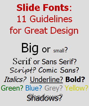
Lately, I’ve been reading about the pursuit of simplicity. In that spirit, I re-read this article to see if I could simplify down from eleven guidelines to just one. Here’s what I came up with…
Make your text large and boring so that your audience can read it quickly and return their attention where it belongs: on you and what you are saying.
Overall, I’m encouraged by the progress being made with respect to text on slides. It’s been a long time since I’ve seen a script font, shadow effects, or ridiculous colors. Although there’s still too much text on slides (and much of it is too small), that’s progress. Let’s keep it going!
Enjoy the full article, and share your insights about slide fonts:
Please share this...
This is one of many public speaking articles featured on Six Minutes.
Subscribe to Six Minutes for free to receive future articles.

Subscribe - It's Free!
| Subscribe via Email | |
| Subscribe via RSS | |
| Follow Us |
|
 Recent Tweets