
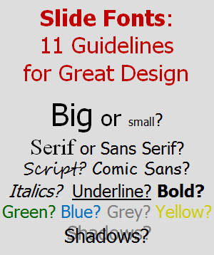
Slide Fonts:
11 Guidelines for Great Design
 When your presentation ends, what would you like your audience to think:
- “Those slide fonts were awesome! So innovative! So artistic! So shadowy and provocative!”
- “I didn’t notice the slide fonts.”
It always surprises me when I encounter a speaker who wants their slide fonts to stand out, as if it were reasonable compensation for a lack of compelling content.
Great design of slide fonts means that they are easy to read and otherwise not noticeable. You want your message to stand out and be memorable, not your slide fonts.
In this article, we look at simple guidelines to help you make wise font choices so that you, and not your fonts, are memorable.
Slide Font Guidelines
You know that you should use visual slides, and thus minimize the amount of text on your slides. That’s not the focus of this article, however.
If you must have text on a slide, then how can you best present that text? The table below summarizes the guidelines, starting with the two most important. Read on for the details and lots of practical examples.
| Core Principles |
|
|---|---|
| Size |
|
| Face |
|
| Decoration |
|
| Color |
|
Guideline #1: Make it readable… from the back of the room with a poor projector and tired eyes at the end of the day.
Where do you design your slides? On a desktop computer with a sharp 24-inch monitor? On a laptop, perhaps? Is your head within 18 inches of your screen? Is the room lighting good? We design slides in fairly optimal conditions with rich displays providing excellent contrast.
But your slides are rarely viewed in optimal conditions. The screens are small. The rooms are large. The projectors always seems to be a little dimmer and a little blurrier than you would like. And someone in your audience was up late last night. Or suffering from allergies. Or behind on their optical prescription.
When you add it up, the text on your slides is much harder to read than it seemed when you created them. Be smart. Design your slides with the largest and easiest-to-read fonts possible.
Guideline #2: Be consistent throughout your slide deck.
What sends a better message?
- A slide deck which resembles a patchwork quilt, with font sizes, faces, and styles randomized on every slide.
- A slide deck which uses a consistent visual theme, including text which looks the same on the 1st slide, 17th slide, and the last slide.
Consistency matters. When your slide deck has a consistent design, your audience doesn’t have to “work hard” to understand the slide. They are free to focus on your message instead.
Guideline #3: Use large fonts.
Every time I teach my presentation design course, I conduct a test using the slide below. I ask everyone to stand, and then begin to call out line numbers from the top of the slide (1, 2, etc.), as I reveal one line at a time. I ask the students to sit down when they can no longer comfortably read the text on the slide. Can you guess what the results are?

Most people in the room are standing until about line 8 or line 9 (18pt or 16pt). But the really interesting thing? At least one person in the room always sits down at line 5 (28pt). Every single time I teach my course.
What does this mean? For the conditions where I teach (room size, screen size, projector quality, etc.), I need to stay above 28 point font if I want everyone in my audience to be comfortable.
30 point font seems absolutely enormous when I design my slides on my desktop computer, but yet this is the size that works for my whole audience.
Guideline #4: Choose three sizes at most.
So all your text is going to be large. Great. Does that mean it all needs to be the same size? Yes and no.
- Body text should be the same size throughout the slide deck.
- Slide titles should be a little larger than the body text, but the same size from slide to slide throughout the deck.
- Text used in tables and figures can be a little smaller than body text.
This 3-tiered system is familiar because other writing follows a similar pattern. For example, in a typical book, headings tend to be larger than paragraph text, and paragraph text tends to be larger than the text used for annotations.
For a course I recently taught, I used 44pt for titles, 36pt for body text, and 30pt for annotations:
| Slide Elements | Size | Notes |
|---|---|---|
| Titles / Assertions | 44pt | Prominence justifies the largest font size. |
| Body text; quotes | 36pt | Still very large; highly readable |
| Tables; labels; annotations | 30pt | Used to annotate figures, graphs, and tables on mostly visual slides |
The room that I teach in may not match the one where you speak, so you may have a different threshold.
Guideline #5: Use sans serif fonts.
Font faces are generally classified into two categories:
- Serif faces are composed of line strokes which vary from thick to thin, and have ends that terminate with decorative serifs.
- Sans serif faces are composed of line strokes with an even width and have plain ends.

Serif fonts are generally acknowledged as superior when printed, so they are a great choice for your handouts. However, the serifs and thin strokes don’t always look crisp on digital displays. So, while you can find success with either serif or sans serif fonts, as a general guideline I recommend you adopt sans serif fonts for your slides. They have better readability across a variety of display conditions.
Guideline #6: Choose a font face appropriate for your audience and message.
As a general guideline, choose a formal, professional font. Any of those shown above (Tahoma, etc.) are fine for this purpose. These fonts won’t undermine your credibility, and that’s the goal.
Font styles to avoid include artistic, playful, funky, script, and many others… unless your audience or message deems that this is a match. If you choose to break this guideline and use a specialty font (for branding reasons, or to tie into your overall theme), then understand the consequences. It won’t be as easy to read. It may be distracting. Only you can judge whether it is worth it.
Guideline #7: Use one or two font faces at most.
Just like the guideline for using consistent font sizes, you should use consistent font faces. Either:
- Choose a single face for all of your text in a slide deck (I do this most often), or
- Choose one face for titles and one for all other text
Using any more than two font faces, or using them inconsistently from slide to slide can make your slide deck look disjointed and awkward. Not good.
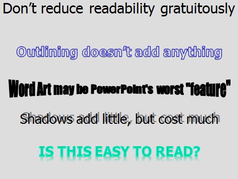
Guideline #8: Never use word art, 3-D effects, shadows, warping, etc.
When I see slides with these types of effects, speakers usually claim that they are “trying to jazz up their slides” or “add some visual interest”. This is very misguided.
These font decorations reduce the readability of your text considerably and accomplish nothing.
Guideline #9: Use bold, italics, or underlines sparingly.
Bold, italic, and underlining are all used to emphasize text, but you don’t need to use all three. In fact, you should definitely not use all three.
- Underlining tends to reduce readability because it cuts through lowercase letters which have descenders, like gjpqy.
- Italics looks very sharp with some fonts (especially serif fonts), but it looks poor with others (especially sans serif fonts). So, if you are using sans serif fonts (like you should), italics may not be the best option.
- Bold tends to work the best of the three for emphasizing key words or phrases. This is what I use most often on my slides.
Whatever your preference, choose one for emphasis and use it sparingly. If you emphasize too many words, the net effect is that nothing is emphasized.
Guideline #10: Ensure high contrast between text and background.
Two universally successful strategies for high contrast are:
- Black text on a solid white (or off-white) background
- White text on a solid black or dark blue/green background
Sadly, many speakers use a variety of lower contrast combinations:
- Grey text on either white or black background
- Light blue/green/red/yellow/brown on a white background
- Any text on a wildly textured background
Don’t make your audience strain just to see the text.

Guideline #11: Use additional colors for emphasis only.
Start by choosing a single text color, and use it consistently across all slides. Optionally, add a complementary color, either for emphasis or for titles, but use it consistently throughout your slide deck.
Never randomly change colors from slide to slide or within a slide with the misguided goal of “adding visual interest”. You will just confuse your audience.
I recommend simple color schemes which offer high readability:
| Slide Background | Primary Text | Emphasis Text |
|---|---|---|
| Black | White | Yellow |
| White | Black | Dark Red |
What do you think?
Do you have any slide font tips to share?
Please share this...
This is one of many public speaking articles featured on Six Minutes.
Subscribe to Six Minutes for free to receive future articles.

Subscribe - It's Free!
| Subscribe via Email | |
| Subscribe via RSS | |
| Follow Us |
|
Similar Articles You May Like...
Find More Articles Tagged:
 10 Comments
 Recent Tweets
Slide Fonts: 11 Guidelines for Great Design http://t.co/GABXXLLgI6 via @6minutes
— @esubialka Oct 7th, 2015
“Slide Fonts: 11 Guidelines for Great Design” http://t.co/QGcUdKwX9P #thinkbig #getbetter
— Jeff Schmidt (@JeffreyASchmidt) Oct 8th, 2015
@SpeechMadeEZ here’s one on designing effective slides http://t.co/bCyWyHek3u
— @neilseq Oct 11th, 2015
Slide Fonts: 11 Guidelines for Great Design http://t.co/hGkSQEH45U
— @FranchettiComm Oct 12th, 2015
Fantastic article; read, shave, share: Slide Fonts: 11 Guidelines for Great Design https://t.co/lhnnoRE5W2 by @6minutes #presentation
— @rennerchicka Nov 11th, 2015
Good hints for using slide Fonts: 11 Guidelines for Great Design https://t.co/gFXzcoTQ0L by @6minutes
— @Peter_iDiagram Nov 23rd, 2015
Slide Fonts: 11 Guidelines for Great Design https://t.co/FgHEs0xiZY
— Patricia Fripp (@PFripp) Nov 29th, 2015
@6minutes just finished reading your article: https://t.co/1UNq5EtqkE and @slidebean and I would love to do a collaboration with you guys 😊
— @JaciAurora Jan 10th, 2016
Slide Fonts: 11 Guidelines for Great Design https://t.co/UDMkmPi9XG by @6minutes #publicspeaking #PowerPoint #NSA16
— Joel Heffner (@JoelHeffner) Feb 11th, 2016
#TuesdayTips Excellent wide-ranging article by @6minutes on slide fonts for your presentations. https://t.co/Gw9S6VSmAF
— PitchVantage (@pitchvantage) May 24th, 2016


Even with all those tools available in the Web, designed to ease the choosing of fonts and colors and palettes; even with all the relentless messages stating “less is more”, this kind of post seems always necessary. And not because people’s bad taste in design, but because it’s easy to forget guidelines like #3 or #10.
Great post!
Very well said, Enzo.
Excellent post! Another point to watch is that unless you embed the fonts in a PowerPoint presentation they may be replaced if that one is not on the computer used with the projector. See:
http://www.ellenfinkelstein.com/pptblog/embedding-fonts-presentation-non-standard-fonts/
and
http://www.pptfaq.com/FAQ00402_Troubleshoot_font_problems.htm
Great advice Andrew. I strongly agree that readability is the greatest need!
I do see a potential use for shadows or outlining sometimes though, because those effects can increase readability in some cases. For instance, if you use black text and some of your slides feature full-screen photos, a white shadow (with a very small offset, unlike the example shown) or a white outline can make the text stand out better if some of the photographs are much darker than most.
My own tip is to use a very common font! If you use a relatively uncommon one – even Gill Sans – you risk the font not being present on the computer that runs your slideshow at the event. (Or, if you’re presenting online through something like Adobe Connect, the font might not be available in that system.)
Coincidentally, I just published some advice about fonts, and featured a short video of what can happen if you choose unwisely. I also feature a list of fonts that are installed on almost every system (if you use PowerPoint).
So I’m completely with you when you suggest picking a font people won’t notice!
Richard and Craig:
I echo your comments about choosing a common font. This pitfall _almost_ happened to me once. I had used a non-standard font, and then put my presentation on a colleague’s laptop (laptops were rare back then). One hour before I was due to speak, I realized that all of the spacing was wrong. I was lucky… I had time to fix it.
Great hints, Adnrew. I’d just add to consider using handwritten fonts – they are getting popular, just see some latest Slideshare on design. Of course I don’t mean to use Comics Sans :). But there are some nice subtle and readable fonts such as “Segoe Script” or “Amatic”.
Be very cautious when using handwritten fonts, as described in Guideline #6 above. If you use one, then know that legibility and readability have decreased. That’s not good. Be sure that the artistic effect you seek is worth it. (It rarely is.)
Andrew, thanks for reply. I agree with being cautious. However, I think readability depends a lot also of size, contrast – as you mentioned in other points. Script fonts are good if they are applied big, e.g. used in titles. And for small details it always safe to use formal well readable fonts like Calibri, Arial, Helvetica. All depends on context :).
Great work! (Dammit! 🙂 )
Can I quibble about number two? There’s a limit to how standard slides can be without making me want to kill myself (and the presenter). After all, if you take that tooooo far you end up with the corporate template – just to make sure everything is the same.
I know you said it’s a guideline not a rule, but… 😉
simon
You can always quibble about anything you read on Six Minutes. In fact, please do! Critical discussion and debate is how we all get better.
As to the point you are making… Sure, it’s not the end of the world if the text on a few slides is a different size or a different face. Guideline #2 is really arguing that consistency is better than randomness, not that a font imperfection will destroy a presentation. Skilled presenters know when to deviate from guidelines, and that’s fine.